Field Tips for Better Project Photos
Some of the most important spaces on a project are also the hardest to photograph. Corridors, built-ins, small offices, mechanical rooms—places where the work is right there, but the walls keep closing in on your lens.
A tight interior can either look cramped and distorted… or clean, intentional, and true to the design. The difference comes down to a few simple choices.
Here’s how to make narrow spaces feel generous on camera.
- Let Your Leading Lines Do the Work – Every tight space has a natural direction. Let it guide the viewer.
Rather than standing off to the side, try placing yourself directly in line with the hallway, cabinet run, or built-in. When the walls and floor converge cleanly toward the back of the frame, the space reads as purposeful instead of cramped.
This also reduces the stretching and warping that happens when you force a diagonal perspective in a narrow room - Keep Your Vertical Lines Straight
Wide lenses exaggerate the height of nearby objects and tilt verticals quickly. In small spaces, that distortion becomes loud.
Keep the camera as level as possible and fix any lean in post. Straight lines communicate order and craftsmanship. Distorted lines signal chaos—even if the space is built perfectly. - Balance the Light, Don’t Fight It
Tight interiors often mix fluorescent, daylight, and spill from adjacent rooms. That can make the space feel smaller than it is.
Two simple tricks help:
Expose for the brightest part of the frame, then lift the shadows later. This protects highlights and keeps surfaces clean.
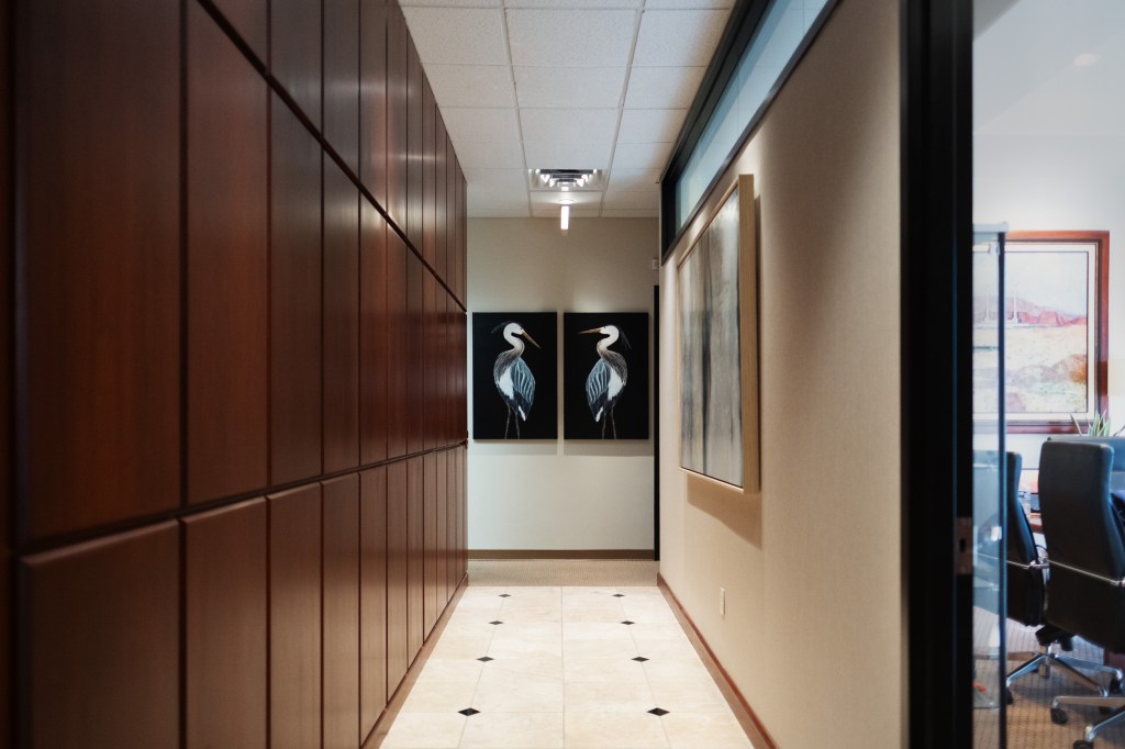
Match color temperatures where you can. Even subtle white-balance mismatches can make a narrow room feel muddier. You’re not trying to make it brighter—you’re trying to make it clearer. - Give the Viewer a Destination In a hallway or corridor, place a point of interest at the far end: a doorway, a light fixture, artwork, even a structural detail. It gives the eye somewhere to travel, which cues the brain to read length instead of confinement.
Your recent hallway photo does this beautifully with art anchoring the frame at the back. That little visual “destination” expands the space without any lens trickery. - Let the Edges Fall Away
If the room allows it, step back just far enough that the walls frame your shot without dominating it. A sliver of a wall, cabinet, or jamb in the foreground creates depth and hints at the rest of the room without crowding the composition.
It’s a small trick that adds a sense of scale and dimensionality.
When You Photograph a Tight Space Well, It Tells a Bigger Story
For contractors, these shots help show craftsmanship that might be missed in wide, open rooms. For designers, they communicate intent: how finishes flow, how rooms connect, how light travels.
👉 Tight spaces deserve a clear story, not a cramped photo. If you want your next project documented with the care it was built with, reach out: taylorg@sitesnapsaz.com

Leave a comment