Designers and builders spend a lot of time choosing the right colors—whether it’s a paint finish, natural stone, or custom woodwork. Those choices define the look and feel of a project. But here’s the challenge: if the photography doesn’t capture those colors accurately, the finished work can look different than what you intended.
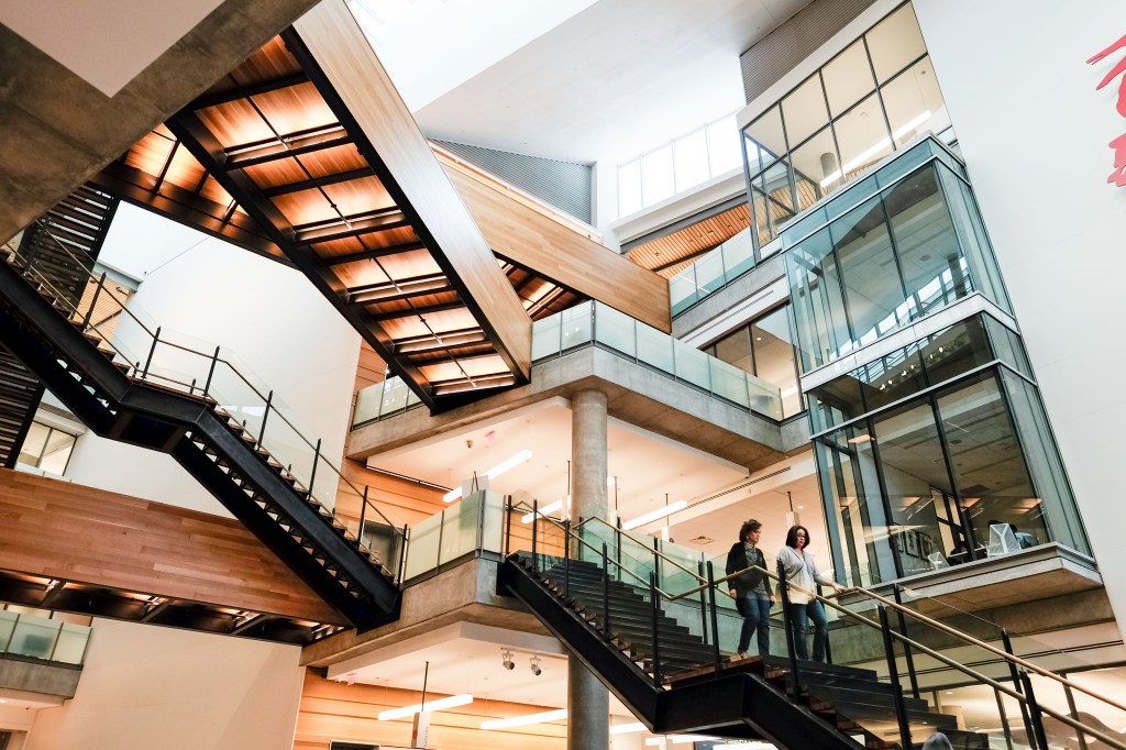
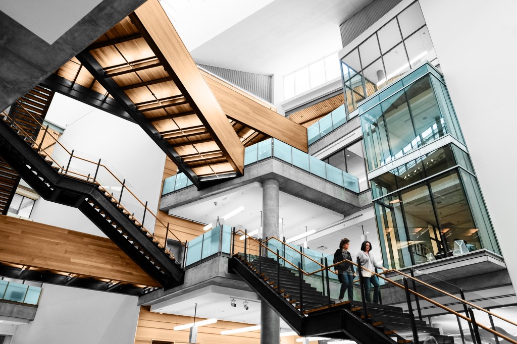
Take a look at these two photos of the same café interior. In the first, the wood tones are rich, the wall color is true, and the overall space feels inviting. In the second, the colors are muted, the wall leans toward green, and the warmth of the wood is lost. Nothing about the design changed—the only difference is how the colors were captured and corrected.
Why Color Shifts in Photos
Cameras don’t see color exactly the way our eyes do. Sensors interpret light differently depending on its temperature (warm vs. cool) and quality (daylight vs. fluorescent vs. LED). For example, a white wall under incandescent lighting may appear orange, while under cool LEDs it can look bluish. Reflections from surrounding surfaces—like green grass outside or red tile flooring—can also subtly cast color into a space. On top of that, many phone cameras automatically apply “corrections” that exaggerate these shifts rather than fixing them. Without professional control, the space that looks perfect in person can feel off in photos.
How Professionals Keep Colors True
Professional photographers use tools and techniques—like calibrated monitors, white balance control, and color correction workflows—to bring images back to reality. The goal isn’t to enhance or exaggerate but to ensure the project is shown exactly as it was designed and built. When finishes and materials are represented faithfully, the craftsmanship speaks for itself.

Why So Many Photos Fall Flat
If you’ve ever looked at photos of your work—whether taken quickly on a phone or even by a photographer—and thought, “That’s not how it really looks,” color accuracy is often the culprit. A slightly off-white wall, wood that feels too dull, or tile that doesn’t match what you specified can all hold back an otherwise strong image. The project itself may be flawless, but if the colors aren’t right, the photo won’t work as hard for you in presentations, marketing, or your portfolio. Correcting color is one of the most important (and overlooked) steps in making sure your work is represented as it should be.
👉Want your work shown in its true colors? Let’s connect about photographing your next project. Reach out at taylorg@sitesnapsaz.com.

Leave a comment